The browser’s new tab was already my most-visited screen after the terminal. That is why I decided to upgrade it. I was opening it throughout the day to find a pull request, return to an internal tool, check a local app, or look something up before going back to code.
The habit was already there. I wanted the screen to serve that habit better: put useful things within reach whenever I arrived, then help me get on with the task.
Most of my attention went into the terminal: the commands, shortcuts, and small adjustments that make repeated work easier. The new tab was just the space before the next URL. Eventually, that felt like a missed opportunity. It was already part of my routine. I could make it useful without creating another place I had to remember to visit.
That became the next version of Tabbit.
The friction is between tasks
A lot of browser work starts with finding my way back to something.
Which window has the repository open? Where is the cloud sign-in page? Which localhost port belongs to this app? Did I leave that issue in a tab, or do I need to search for it again?
Each question is small. The annoying part is answering it while trying to hold the actual task in my head. I open a tab with an intention, spend a moment finding the destination, and pick up a few competing things along the way.
A useful new tab shortens that route. The work links I need often are already there. Local apps have a place of their own. Search can take me back to an existing tab instead of making me open another copy.
I have not measured hours saved. The improvement I care about is more immediate: fewer decisions before I get to the thing I opened the browser to do.
Put the familiar things first
The first design decision was the order of the page.
My regular work destinations belong near the top. Dev servers should be easy to reach. A brief can help me return to a thread, but it should not push the links I use every day below the fold. News can wait until after those things.
That order matters more than how many features fit on the page. If I have to scroll past a summary to open my local app, the summary has made my work harder.
Tabbit now starts with search, a small pair of controls, and editable shortcuts. Dev servers and a compact brief come next. The brief expands when I want more detail. Longer lists—other work links, open tabs, saved sessions—stay folded away until needed.
I also wanted it to feel like somewhere familiar. Simple pill buttons, steady spacing, and a predictable layout help. I want to recognize where things are before I have to read them.
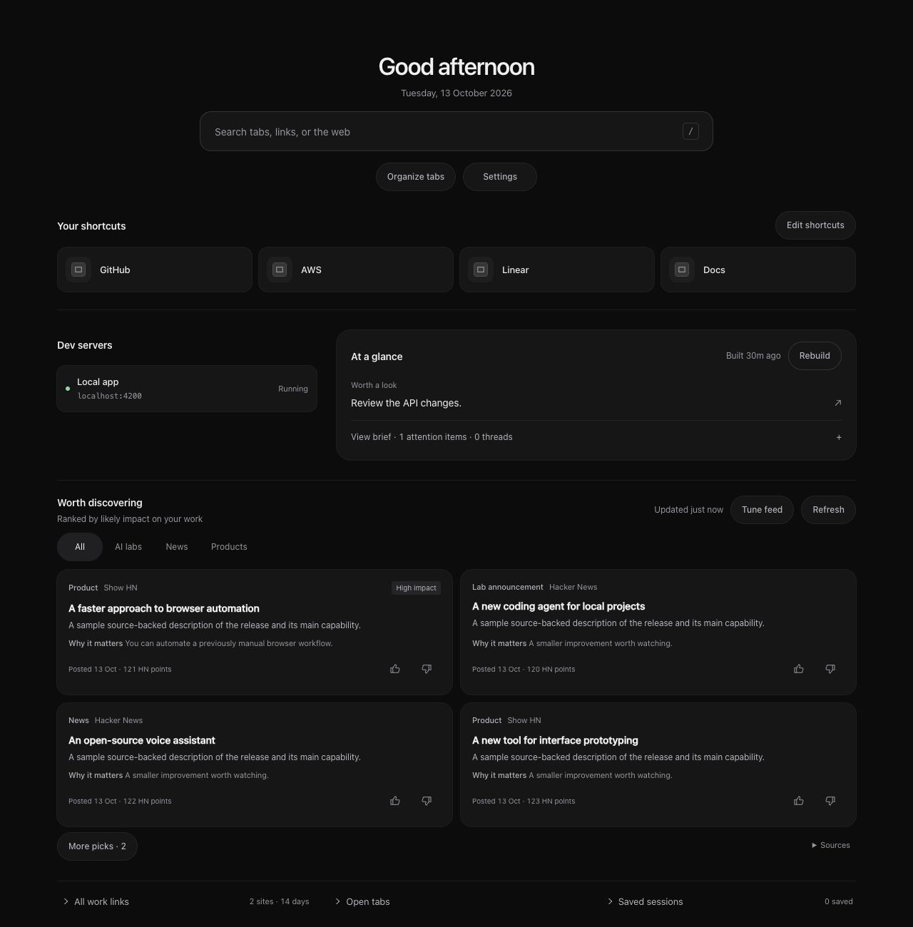
An illustrative Tabbit preview. The links and feed items shown here are demo data.
A new tab should remember
The most frustrating version of this page would be one that started calculating every time I opened it.
New tabs are temporary. I open one, change my mind, close it, and open another. The useful state should survive that behavior.
Tabbit keeps brief and feed generation in the background and saves the results. Closing the page does not discard the job. A fresh tab can show the last edition while a new one is being prepared. The dashboard also reuses saved data before refreshing it.
This is part of the productivity benefit. An interface that asks me to wait, rebuild, or supervise it has introduced a new task. Keeping the result available lets me use it when I need it and move on.
Give discovery a limit
I do want news and new products on this screen. AI releases and developer tools can change what is possible in the work I am already doing. I want to notice those changes without turning every new tab into a reading session.
So the feed is a small edition, with more items available on request. Browsing interests help choose sources. Major AI labs have an explicit watchlist. Recent, substantial announcements should rise above older coverage and minor updates. Thumbs-up and thumbs-down feedback let me steer subsequent editions.
The useful question for each item is: what changed, and why might it matter to my work?
There are limits. A model’s impact estimate is a judgment. Source pages can be incomplete, and an announcement can be missed. The feed gives me a shortlist and links to investigate; it does not replace reading the source.
Keep the browser easy to leave
Tabbit still organizes tabs into Chrome’s native groups. I can start that from the new tab, leave pinned tabs alone, and continue using the groups as ordinary Chrome groups. I do not have to move my work into a separate workspace system.
The same principle applies to AI. I can choose an OpenAI API key or a locally signed-in Codex or Claude CLI, and choose models separately for selection and writing. The page keeps its shape when the provider changes. Subscription access needs a local bridge, and generation still sends the selected context to the chosen provider—including page text when the brief or feed reads sources.
The point of those choices is to keep the tool fitted to my workflow. They should not become the workflow themselves.
Improve the screen you already visit
This is what I like about personal software: the starting point can be a very ordinary irritation.
I did not need another productivity destination. I needed the destination I was already opening to help me get back to work.
The terminal gets attention because I spend so much time there. The new tab deserves some of that same care. When it puts the next useful action within reach—and lets everything else stay quiet—it makes the transitions through the day a little easier.